Our Brand Identity
Our Brand Identity
For the last 50 years, DHIC has served the community with great care and intention to create opportunity, promote equity, empower people, and center the community. Our new brand identity embodies what DHIC stands for and will continue to stand for, for the next 50 years.
Download the DHIC Brand Style Guide
The Icon
The DHIC ‘D’ icon is comprised of four quadrants, each representing a core pillar of DHIC: Equity, Community, Opportunity, and Empowerment.
![]()
![]()
![]()
![]()
The Logos
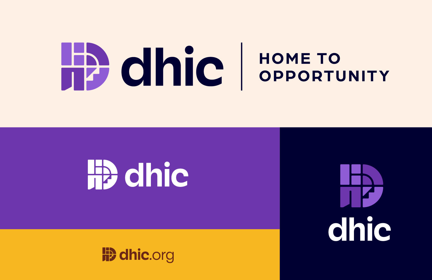
Comprised of the ‘D’ mark, an all lowercase ‘dhic’ wordmark, and an optional tagline, the DHIC logo captures the friendliness, care and professionalism that is foundational to DHIC.
Logos are available in multiple colorways for use on light and dark backgrounds, as well as in one color.
50th Anniversary Logos
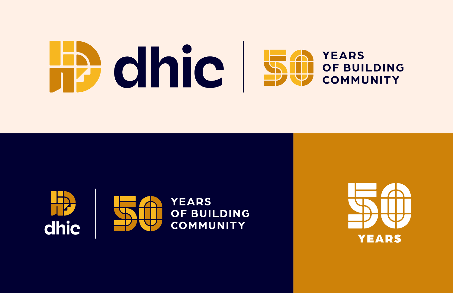
2024 marks the 50th anniversary of DHIC. To commemorate 50 years of building community, the DHIC logo is in Gold and includes a tagline with a stylized ‘50’ mark, created from shapes found within the ‘D’ mark.
Logos are available in multiple colorways for use on light and dark backgrounds, as well as in one color.
Brand Colors
Four main colors make up the brand’s color palette, with a wide range of shades to choose from. For text, it is important to use high contrasting color pairings so the text is easily legible. For backgrounds, using light shades over darker shades of the same color works well when graphics do not have to be highly legible.


Brand Fonts
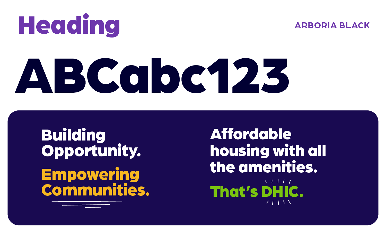
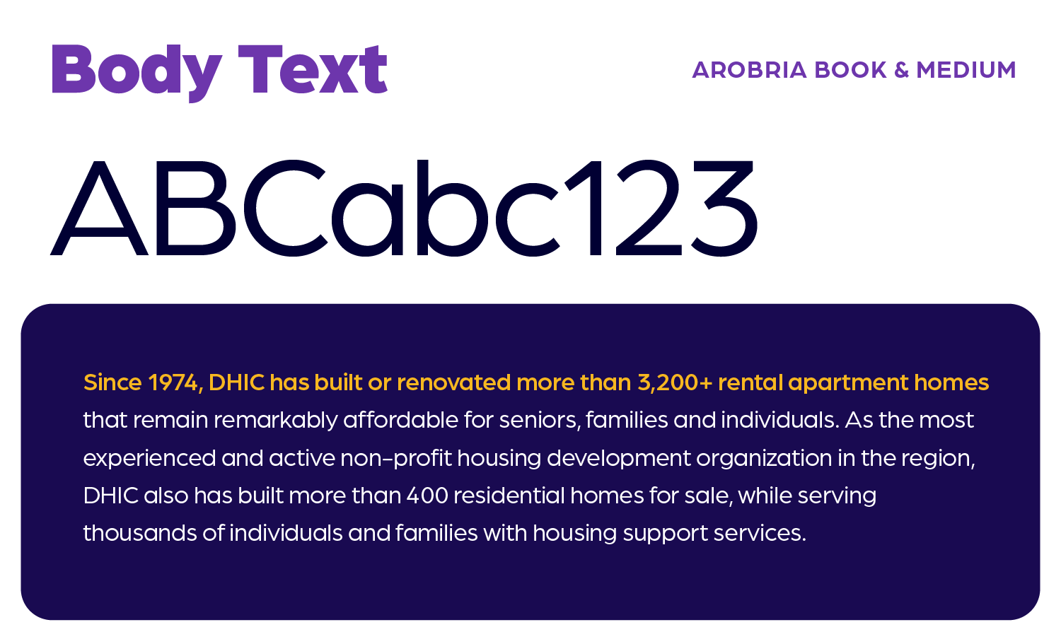
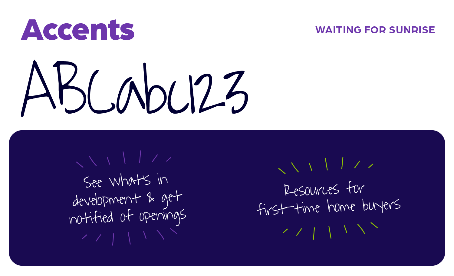
The primary brand font is Arboria, in varying weights. Headings are most commonly set in Arboria Black and body copy is Arboria Book or Medium. For accents and graphic treatments, the handwritten-style font, Waiting for Sunrise, is used.
